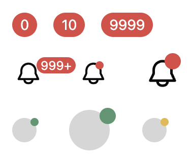
Badge variations
4 components
Avatar variations
9 components, Badge is used
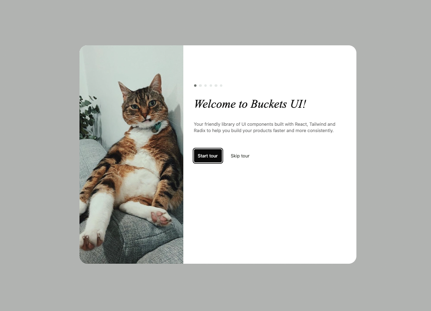
Onboarding dialog
1 component, Badge is used
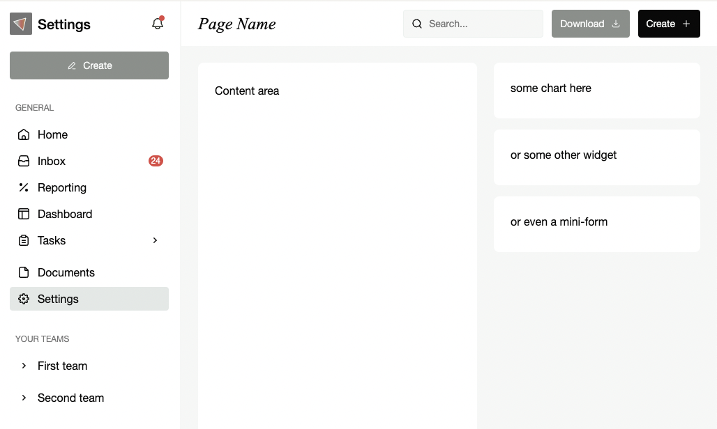
Three column layout with a sidebar, content area and top bar navigation
1 component, Badge is used
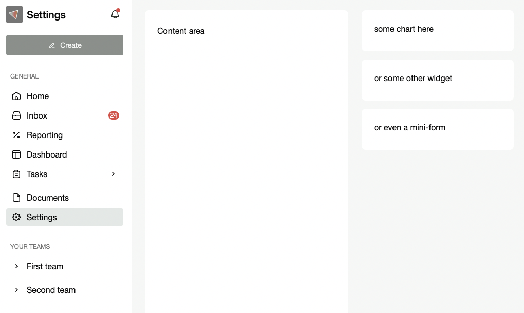
Three column layout with a sidebar, content area and widgets column
1 component, Badge is used
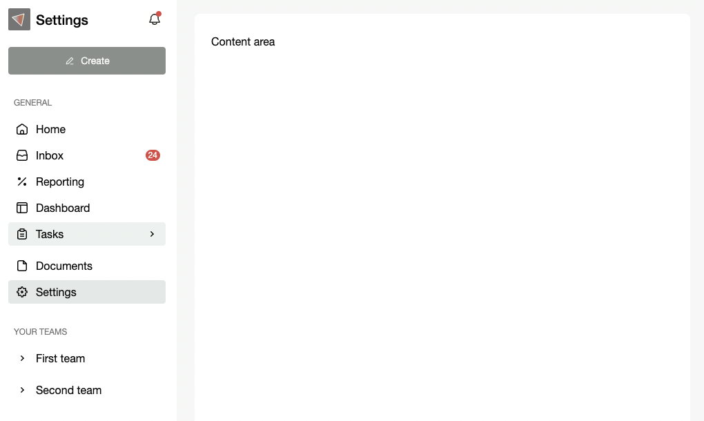
Two column layout with a sidebar and content area
1 component, Badge is used
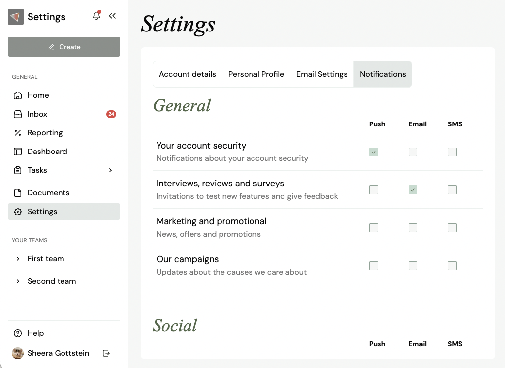
Notifications settings page
1 component, Badge is used
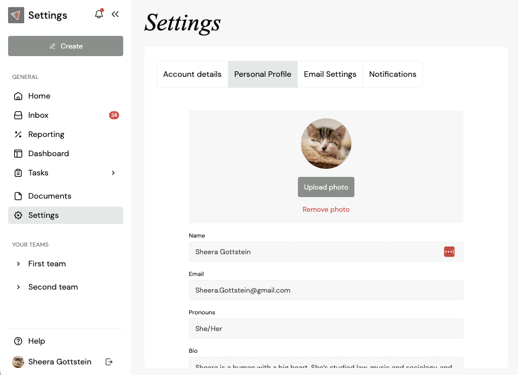
Profile settings page
1 component, Badge is used
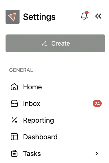
Collapsible primary sidebar
1 component, Badge is used
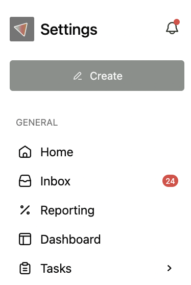
Fixed width primary sidebar
1 component, Badge is used

Tabs with full appearance
5 components, Badge is used

Tabs with minimal appearance
5 components, Badge is used

Tabs with reduced appearance
4 components, Badge is used
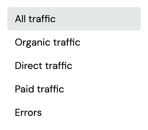
Vertical tabs
4 components, Badge is used
Build beautiful products quickly with Buckets UI.
Located all over the world. Mostly in Australia.
© Shipmate Labs 2024 All rights reserved.
© Shipmate Labs 2024 All rights reserved.
Build beautiful products quickly with Buckets UI.
Located all over the world. Mostly in Australia.